
The Chef’s Studio / Branding
A distinctive name, in a distinctive form.
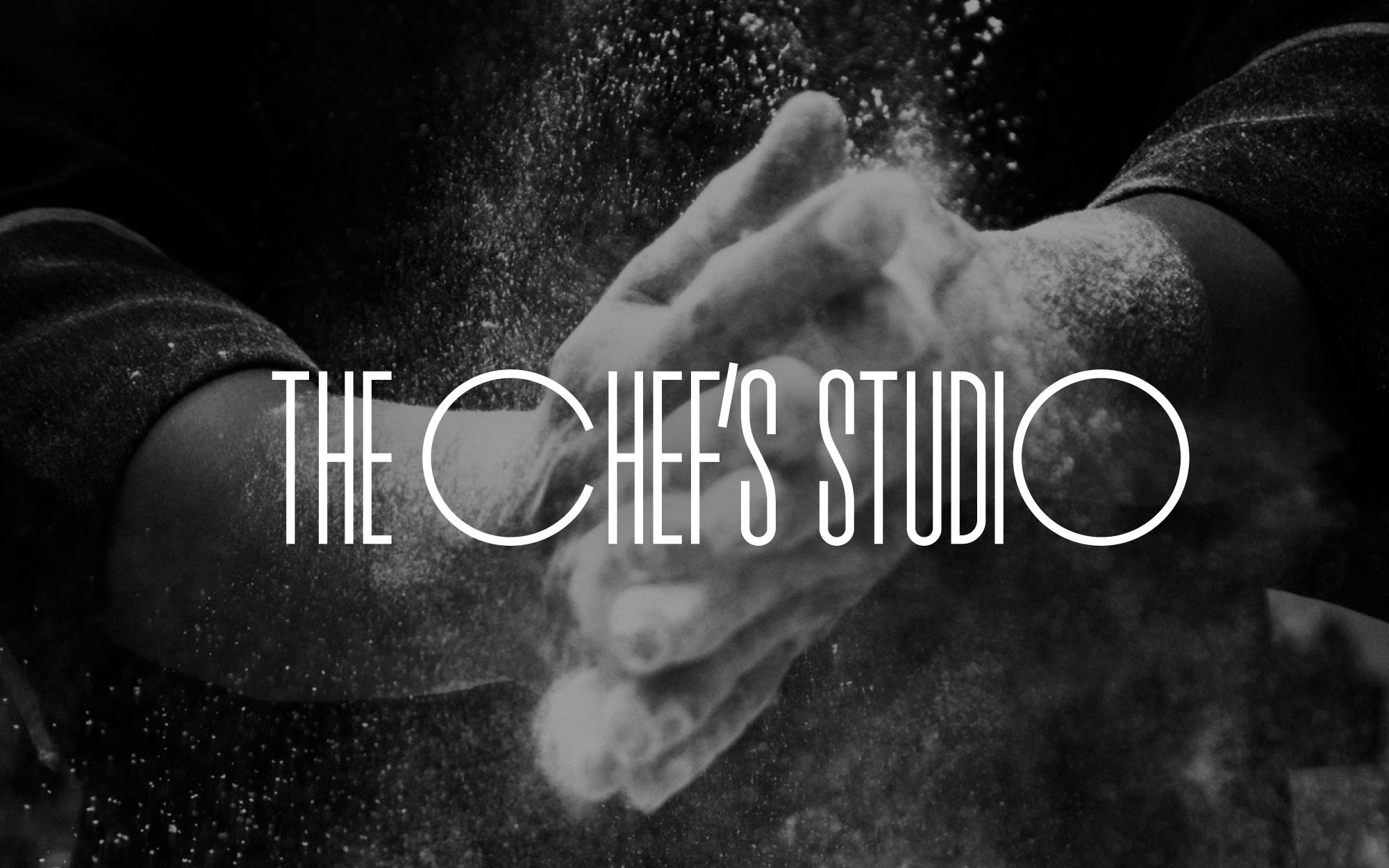
A custom wordmark set against the energy of a kitchen moment.
The Chef’s Studio
The Chef’s Studio wordmark combines tall letterforms with circular characters. White typography sits over a black-and-white image of hands working with flour.
The identity uses the contrast between the letterforms and the photographic texture to give the name a clear presence.
Let’s create something together
What do you have in mind?
Tell us about your project.